Chris Bryant
Creative Design

Portfolio reel of Chris Bryant Creative Designs outcomes

My Portfolio

Clean Creatives logoEcologi logo
Drum & Monkey Brewing logoDrum & Monkey Brewing logoDrum & Monkey Brewing beer matt visualDrum & Monkey Brewing logoDrum & Monkey Brewing logo
Drum & Monkey Brewing bottle cap visual

Stamford Town Council Climate Action Committee visual identity

Brand & visual identity for the local councils climate action group

Stamford Town Council Climate Action Committee logo black and white
Stamford Town Council Climate Action Committee logo visual
Stamford Town Council Climate Action Committee logo colourgraphic design, branding, visual identity, graphic communication, advertising, design, complimentary, stamford, lincolnshire
graphic design, branding, visual identity, graphic communication, advertising, design, complimentary, stamford, lincolnshire

Final project MA Graphic Design

Branding & visual identity

I have created a design school within the education institution I work for for the final project of the MA in Graphic Design I am studying. This design school would deliver a BA (Hons) in Graphic Communication & Interactive Media course, focusing on delivering industry-relevant creative skills and techniques. The course is a hybrid course that mixes graphic design principles with media applications. For the MA project, in addition to this branding solution for a design school, I have produced a course specification for the BA (Hons) course. I have taken inspiration from contemporary practice in tandem with modern and industry-led practices in visual communication. In tandem with these visual outcomes, the typeface featured in the course specification document and in this branding is a custom-crafted typeface of my devising. This typeface was inspired by the typeface Universal created as part of the Bauhaus. The typeface was created using a grid system developed from a grid system I have also evolved.

graphic design, branding, visual identity, graphic communication, advertising, design, complimentary, stamford, lincolnshiregraphic design, branding, visual identity, graphic communication, advertising, design, complimentary, stamford, lincolnshiregraphic design, branding, visual identity, graphic communication, advertising, design, complimentarygraphic design, branding, visual identity, graphic communication, advertising, design, complimentary, stamford, lincolnshiregraphic design, branding, visual identity, graphic communication, advertising, design, complimentary, stamford, lincolnshire
ProofTEK logoProofTEK logoProofTEK logo
graphic design, branding, visual identity, graphic communication, advertising, design, complimentary, stamford, lincolnshire

Mile Tree Brewery

Brand Identity &
Pump Clip Project

Logo development
Brand identity management
Colour scheme integration

I was initially contacted by Richard Matthews to design him a new logo for his brewery, as he felt like his branding was getting lost in the competitive market of craft ales. I set to work incorporating the landscape around the origins of the brewery into the combination-mark logo. Together we developed a logo which he felt communicated his breweries mantra to his target market in the craft ale sector.
He had a strong idea of what he wanted, and gave me great direction for developing his logo.
After the logo was approved, the project progressed to designing the first of a range of pump clips for the ales he brews. Again I incorporated the logo into the branding to form the pump clip for the first of his ales which will be served in pubs around my local area.

Design Principle Studio brand concept

Logo creation
Compsheet creation
Visual identity development

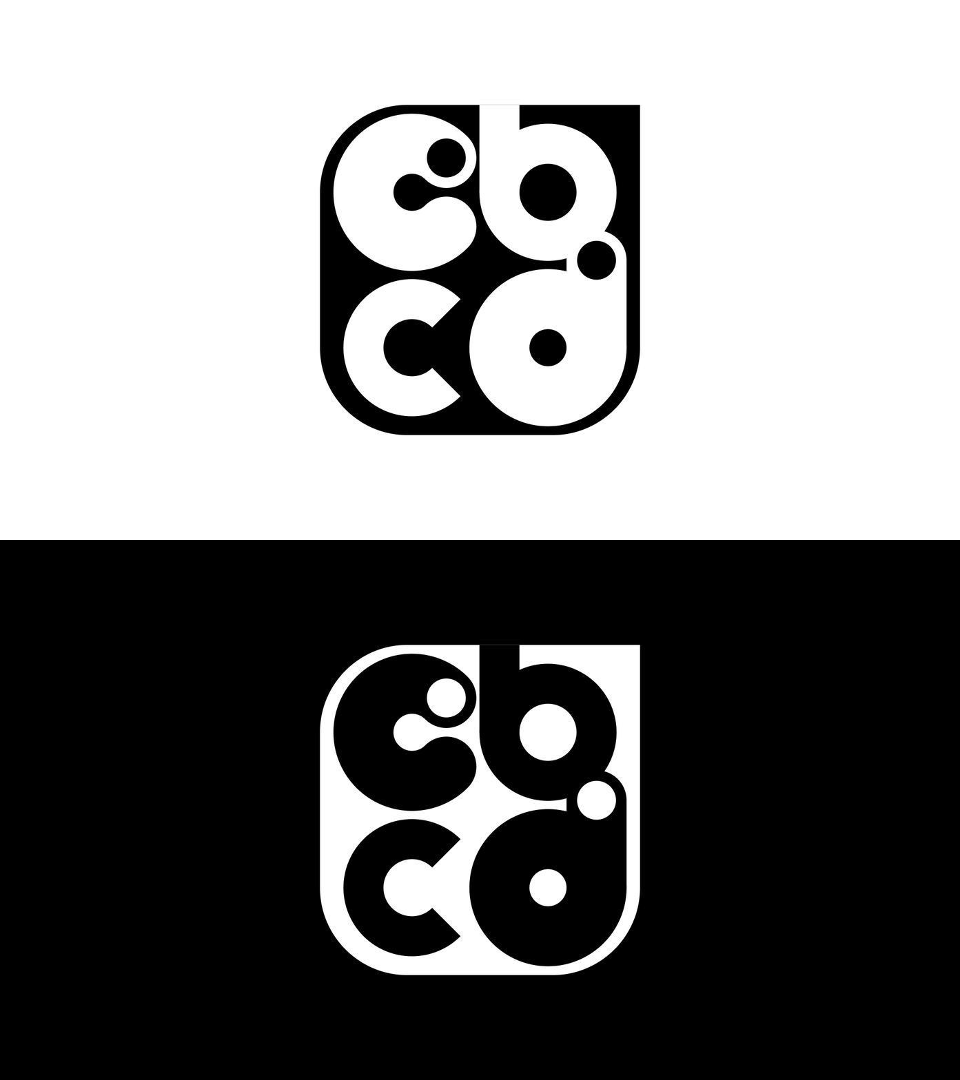
This project involved creating a contemporary branding solution for the architectural firm Design Principle Studio. I used the characters of the initials in the business name to create combination-mark and lettermark logomarks in conjunction with the type to create a brand identity. A complimentary colour scheme was established and applied to the logo to form the branding for the business. This project exemplifies how I create a range of compsheets before progressing to a logo design in a branding project.

The Posh Property Co.

Logo creation
Brand identity conception
Visual identity development

From integrating a collaborative project within my teaching delivery, I built a friendship with Joe and her partner Stu who approached me to develop a brand identity for Stu's business The Posh Property Co. They wanted a logo design which communicated the businesses primary service offerings which are fencing, roofing and property maintenance. From the initial brief, I knew a combination-mark logo design would best suit their needs. I was given some guidance for the colour scheme, of which I developed into the above branding. The logo and branding are to be applied to Stu's van, clothing and business materials. This to date has been one of the most enjoyable projects I have worked on and I am happy with the end result and look forward to future projects with the fantastic couple.

Stamford letterform

Custom typography letterform design

This is a custom letterform which I designed as part of my studies towards my MA in graphic design. The letterform had to incorporate the heritage and beginnings of the location I live in. This design was inspired by the name which my town originated from, which is Stony Ford. Due to the fords which were created to cross the rivers around my town, for trade and passage in and out of Stamford. I created this custom letterform using a grid system, and incorporated a colour scheme which could identify the elements within it.

Stamford Diversity Group

Visual communication & brand identity development

I first became aware of Stamford Diversity through working at my college institution when I was exploring external groups to collaborate with for a project to introduce my students to a live brief. Which I have now written and will be integrating into the course I lead from September 2023. They will create a motion graphic advertisement video to promote the Stamford Diversity Festival once a year.
In tandem with this, I also required a service to design for which makes an impact in the real world as part of the MA in Graphic Design I am studying towards. So I decided to redesign the logo and brand identity for the group as I felt the essence of the group needs to communicate more effectively the core values and  aspirations, it strives to embed in the community. In addition to the new logo form, wordmark, and combination marks I have designed, I created a motion graphic advertisement video to promote the group. In this video, I incorporated the visual elements of the branding with the colour scheme I developed. With photography provided by Stamford Diversity, I have integrated all these elements into a motion graphic video to promote Stamford Diversity. Another reason for creating a motion graphic advertisement video was to provide inspiration and demonstrate the project requirements, which my students will be working on for Stamford Diversity from September. This self-initiated project I have conducted has been based on my strengths in visual communication. Self-initiated projects through my MA have effectively enhanced my skillset in areas of creativity which I want to refine. Unfortunately, the visual identity I have created will not be able to be used for the next Stamford Diversity Festival due to timing constraints. However, this project has enabled me to build upon my experience and development in branding and visual communication. This is an example and addition to my portfolio of work showcase how I can take an existing design, develop it, and bring the visual language to today's style and design application. I plan to utilise my abilities within the invention in my educational delivery. Through collaboration with Stamford Diversity as part of my full time role as a lecturer, I am now going to be part of the group to help encourage diversity, through my creative skillset.

Stamford
Green Quarter

This is a piece of work I did towards the MA in Graphic Design I am currently studying. The project was to design something which relates to the idea of 'noticing the ignored'. To which I chose to produce a poster design and social media posts for The Green Quarter in Stamford, Lincolnshire. This is a street in my local market town which has a series of three sustainable, ethical and plant-based businesses. Now that green issues and sustaining the environment has become more of an issue to the general public I decided to further promote The Green Quarter by producing this advertisement campaign for the three businesses. I used the symbolism of a mathematical quarter, together with a clean typeface, and complimentary colours which relate and symbolise the three businesses from their existing branding. This was to date the most enjoyable project I worked on for my MA and I'm looking further to my studies further refining my skillset in graphic design and my delivery within education.

Logo design &
brand development

Balanced by Bowen

Balanced by Bowen logo

Logo creation
Brand identity development
Colour scheme integration

Lucy needed a new brand identity for her business Balanced by Bowen, which is a therapeutic relaxation, repair and renewal experience. She's based in the same town as me so it was great to be able to collaborate with a business so close to home. I went through a variety of concepts for her re-design, first exploring the heritage of Bowen, it's origins and trying to incorporate the heritage behind it.
My process of creating a range of comp sheets to present a range of ideas to her really worked with this project, and she was left spoilt for choice with designs.
Eventually, we decided to progress with this combination mark logo design, incorporating the hand position the therapist uses to work on the body.
This hand position is the same for each technique used in Bowen therapy, so I felt it was a strong route to go down.
The colour scheme chose for the brand identity is relaxed and subtle, which was the message she wanted her clients to receive. I chose colours which complimented each other, to represent her brand and ethos behind her business. The end result is this combination mark which spells the name of her business, visualises the key values in her service, and represents the technique she will use to relax, repair and renew your body.

Brother Nature

Brother Nature logo
Logo design development &
brand guideline document

Logo design
Brand guideline document creation
Colour scheme integration
Brand identity development

Leighton contacted me to create a new brand identity for his male grooming product range. He had a strong idea of what he wanted to achieve with his branding. The idea for the logo, representing a Ginkgo leaf from a Ginkgo tree was his own creation. Which I used in an illustration, in a circular design to encompass continuity within his, earthy sustainable design.
The colour scheme chose was eventually settled on after exploring a range of colour schemes. Together we settled for this earthy, yet refreshing scheme to present his branding to his target audience. I chose to use an illustration route, as he wanted a more organic look to his branding. Together we arrived at this design which he felt worked well for his business.

To tie the project all together I supplied Leighton with one of my brand-packs, which is a selection of files for print and screen use, in the correct file formats all together in a folder zipped up and shared with a client through my cloud platform.

All Good Market

Brand identity redesign

Visual identity
Brand awareness
Logo development

Also supporting my progression is this project, a redesign of a local ethical and re-usable product business in my local area. After discussing my project with the shop owner, I sought feedback on what they required from a new brand identity. From a conversation I had with one of the owners, the primary colour, within the brand colour scheme I created was forged. The logo itself, which is an emblem design, encompasses the ethos behind he business. I housed an environment within a wicker basket in the form of shapes to communicate the positive action which can be establish by buying ethical and sustainable products. The location of the store was incorporated into the emblem design by the roads either side of the wicker basket. The handle of the wicker basket also represents a rainbow within the environment.

Green Group project
part of my MA
in graphic design

Brand development
Brand identity development
Logo design

An ethical and sustainability group which required a new brand and visual identity, to incorporate the ethos and message behind prolonging the lifespan of the environment we live in through education

As part of the module, Application & Interactions, for my MA in Graphic Design, I was required to collaborate with a partner who I had a previous connection to. I chose to redesign the Green Group, which I am the Green Ambassador for which is a part of Inspire Education Group. The Green Group is made up of Staff who believe in sustainability and positive action towards sustaining the environment we live in. The group had little brand identity and I felt the groups message was important enough to visualise. I developed a range of concepts which I presented to the marketing team at Inspire Education Group. From their feedback on my initial concepts they felt the group needed a connection to Inspire Education Group. From the collaboration I incorporated the 'Inspire spark' symbol into my combination and logo-mark designs to connect the educational group to the Green Group.

Pushkar

Pushkar logo
Brand identity of a holiday resort
Pushkar is a holiday retreat in production in Portugal at the moment. The resort will offer a get away from busy life with yoga, food, relaxation & more. The original brief for this branding project was to incorporate a water lilly, & the sea which are key features of the resort. I kept the colour scheme fun and playful for this project, utilising complimentary colours of blue, yellow & green to form the basis of this branding project.
The combination-mark logo design replicates the motion of waves within the type of the logo in some of the variations, bringing relevance to the logo. I chose to use a dark blue colour for the key features of the logo, and use the other supporting colours to make up the branding for this project.
This project was a refreshing change, as it offered me a new medium of which to work to. Developing the branding from the ground up gave me plenty of scope for creativity.

Past work